The Making of the Makerspace.
The KID Museum is the nation’s largest educational makerspace for kids. After years of searching for a permanent home, their new headquarters needed to invoke the same creativity that their programs did. That’s where we came in.
-
Our client was the KID Museum, an educational makerspace that provides hands-on programs to kids, families and educators.
-
I collaborated with multiple client representatives, one Level 3 Graphic Designer and a print-vendor.
-
Worked with a level 3 graphic designer to finesse a client provided direction, designed over 500 square feet of environmental graphics, and prepared all necessary documentation to facilitate coordination with the preselected print vendor.
-
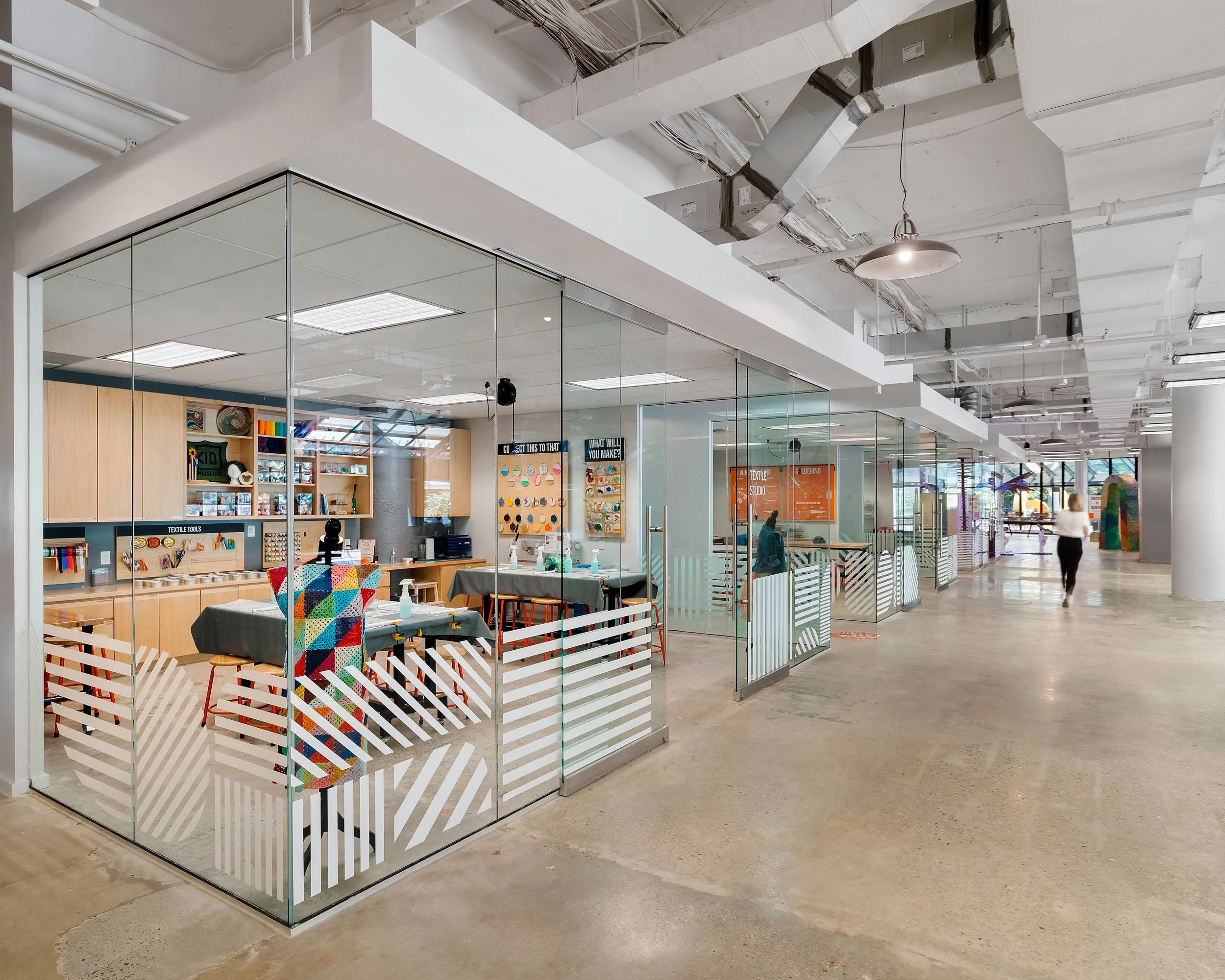
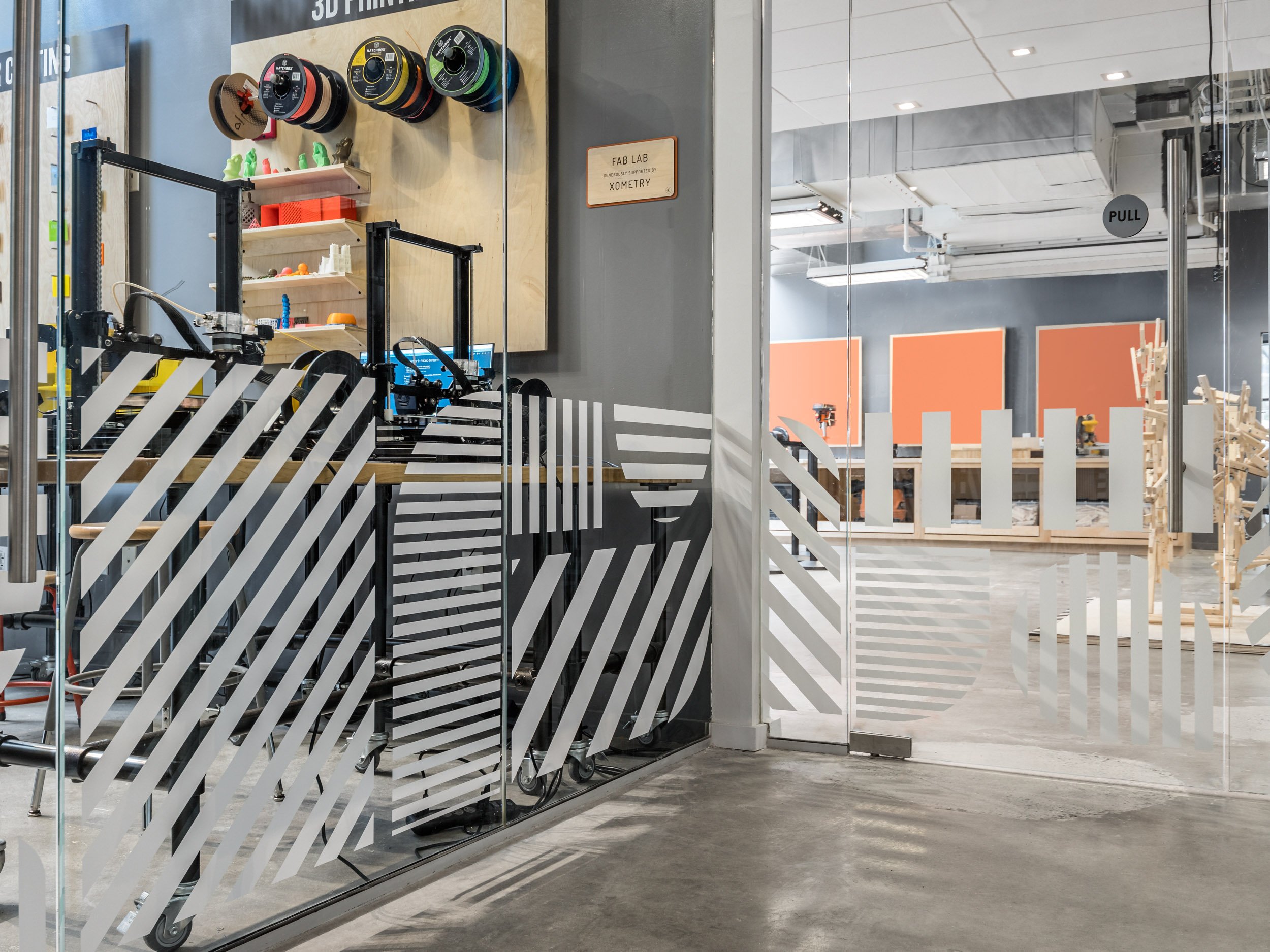
Create an environmental graphic system that would serve as both a visual barrier for children and an appealing graphic to enhance a series of jewel-box spaces. The graphics couldn’t obstruct the classes and activities that would be hosted within each room throughout the day.
-
The KID Museum arrived with a gameplan from the get-go: design a series of distraction bands for 7 jewel-box rooms before their big grand opening in less than 2 months time. The museum had a basis for the design, given to them by another designer, but needed our help figuring out how to use it. It was crucial to arrive on the right solution quickly with as few revisions as possible.
We began by getting a clear understanding of the requirements, while I simultaneously coordinated the on-site measurements with the print vendor. A major goal of the museum was to incentivize experimentation and make any activity or class feel inviting and accessible. This meant that the graphics had to be bold without being distracting or overpowering. What we did was prepare a series of options where the height, location and opaqueness of the graphics varied based on our research around the ages and visibility ranges for spaces of this style. The result was a graphic that would hug the floor, but extend upwards just enough for children to clearly know what the perimeter of each room was. Next, we needed to figure out a graphic system that could be repeated quickly and efficiently through multiple rooms without ever being the same.
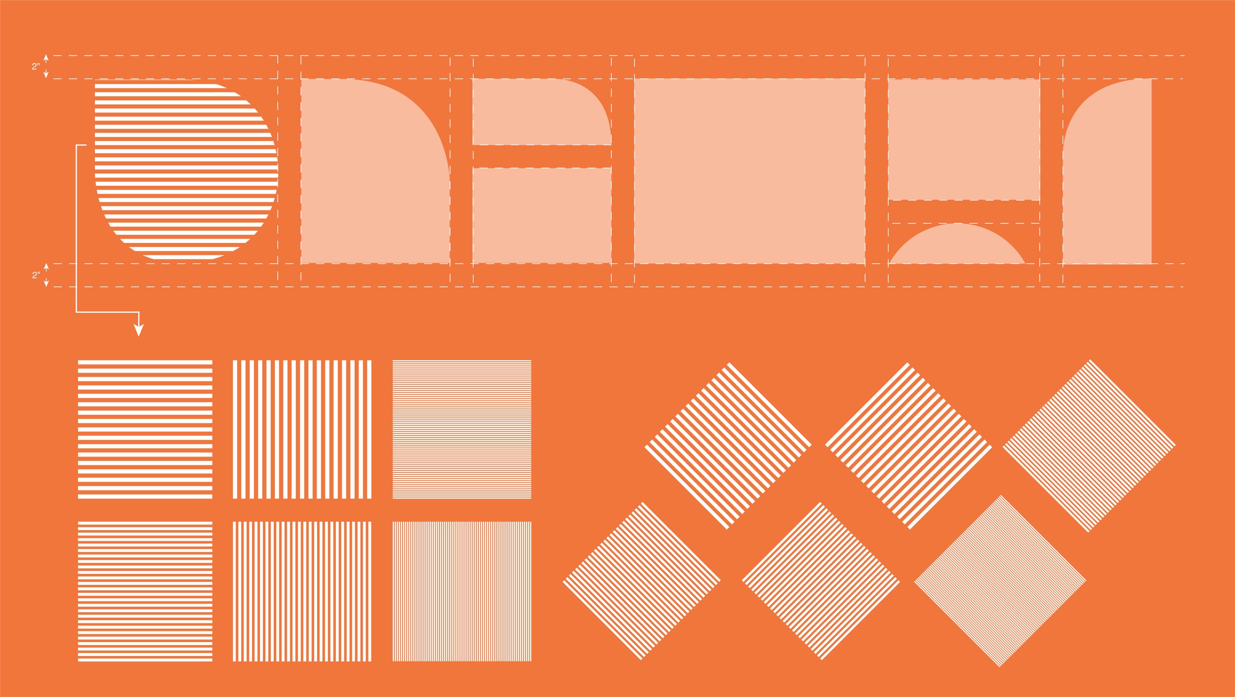
Using the clients provided graphic style we were able to circumvent the lengthy preliminary concepts step and jump directly into developed options. I started by creating a family of line patterns where each set would be thicker than the first to build-in variation. Then I created a series of geometric silhouettes that I could use to “punch-out” the line patterns to create further variation using the same shapes. Finally I calculated the ideal sizes, spacing, and distribution of these shapes on a horizontal canvas, making sure I respected on-site parameters like doors and the separation between the glass partitions. This meticulous pattern system allowed me to create, potentially, an infinite amount of designs that all worked harmoniously with one another in record time. As a time saving measure, it was an incredibly effective tool and helped us hit the deadline with time to spare.
-
The designs helped bring the space together and gave the museum a unique flair. The client was thrilled with the result and informed us that the designs were loved by them and their visitors alike. The geometric pattern system we used was so successful, that the client hired us to design 3 other spaces and a series of informational posters for their events.
ENVIRONMENTAL BRANDING / COLLATERAL
Agency: Michael Marshall Design
Client: KID Museum