Streamlining Corporate.
A brand refresh effort tasked with elevating a company’s identity to the same level as it’s stellar reputation and work. Building on top of years of equity, we brought their vision full circle.
-
Our client was a for-profit government and commercial management firm in the District of Columbia.
-
I collaborated with a Creative Director, two Level 3 Graphic Designers and a web development consultant.
-
Led a team of two designers through all major design stages, recommended key features and functions to the client, established design direction, and coordinated with web developers.
-
Develop, expand and formalize the brand voice of an existing company throughout its lifespan and distill its track record and success into a coherent and impactful identity through guidelines, collateral assets, website design, and company materials.
-
Chaise Group LLC, our client, is an established management firm with almost a decade of experience working with companies and government entities in the District of Columbia. They have built an impressive portfolio, working with more than 21 organizations including the DC government, USDA and more. Chaise had a strong client network, a solid system to achieve results, and a stellar track record, but lacked a key component for their business: a brand.
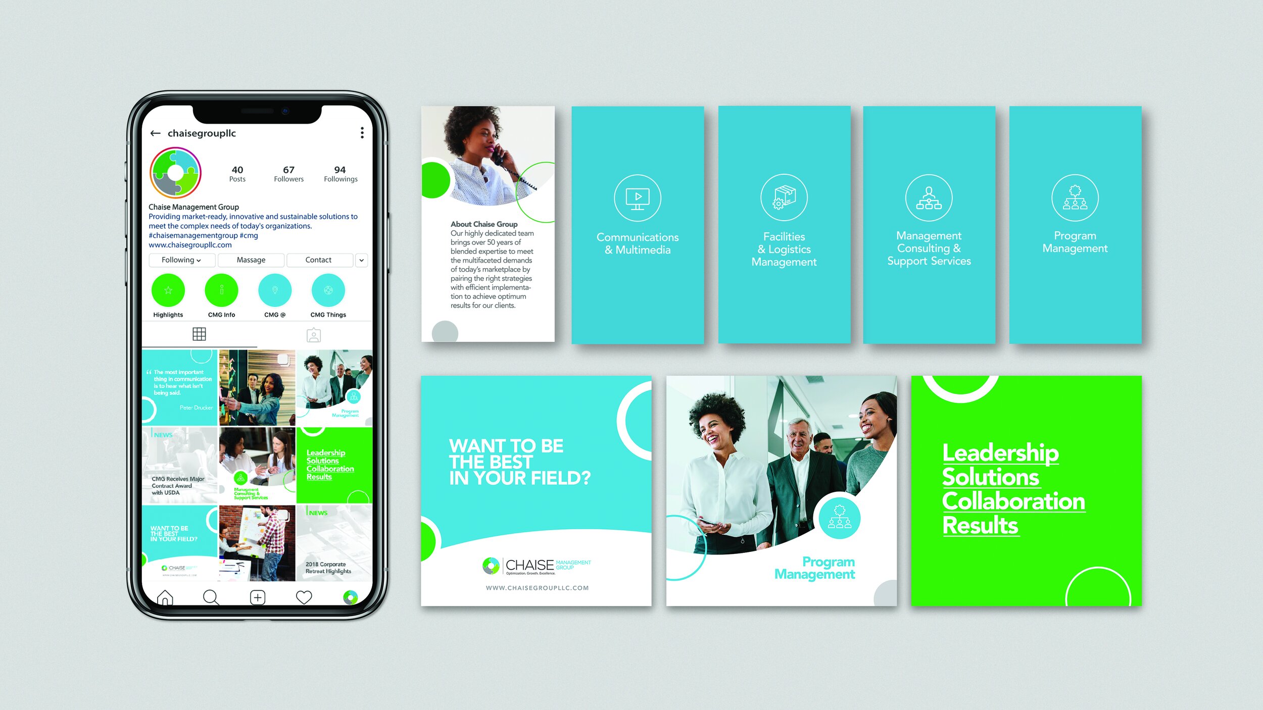
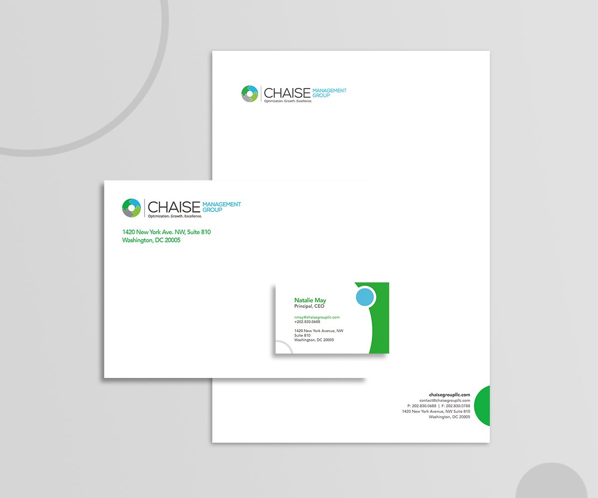
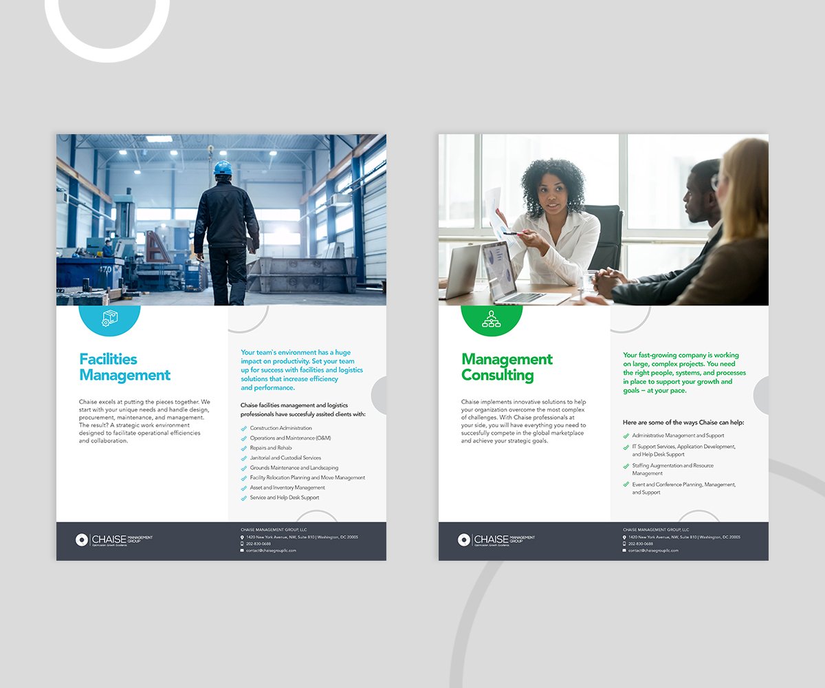
When Chaise tapped us to work with them, they had a functioning website, a logo, some solid copy but nothing to tie it all together. Our focus was to fully explore and develop their identity without losing the equity they had built over the years. The comprehensive scope of work included: brand guidelines, logo refresh, website, collateral, stationery package, business cards, social media assets, and more.
We began with a brand audit. Chaise’s existing voice was serious, results-driven and corporate sounding. We proposed a more approachable identity that proudly leaned on their experience and succinctly laid out their unique service packages. Lastly, using the existing logo as a basis, we generated a refreshing, confident and corporate style inspired by the circles and overlaps in the original.
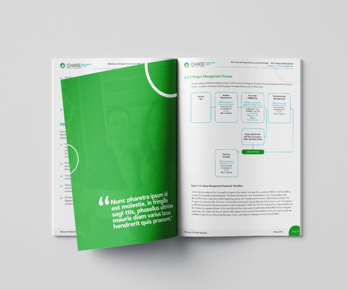
The result is a colorful, contemporary and dynamic design that served as the foundation for the identity, and perfectly captured the tone the company was striving for. The main design motifs consisted of striking colored blocks and semicircles that helped give each piece a unique identifier and a sense of levity. The juxtaposition of these elements allowed our design team to highlight critical information while keeping decorative design elements to a minimum.
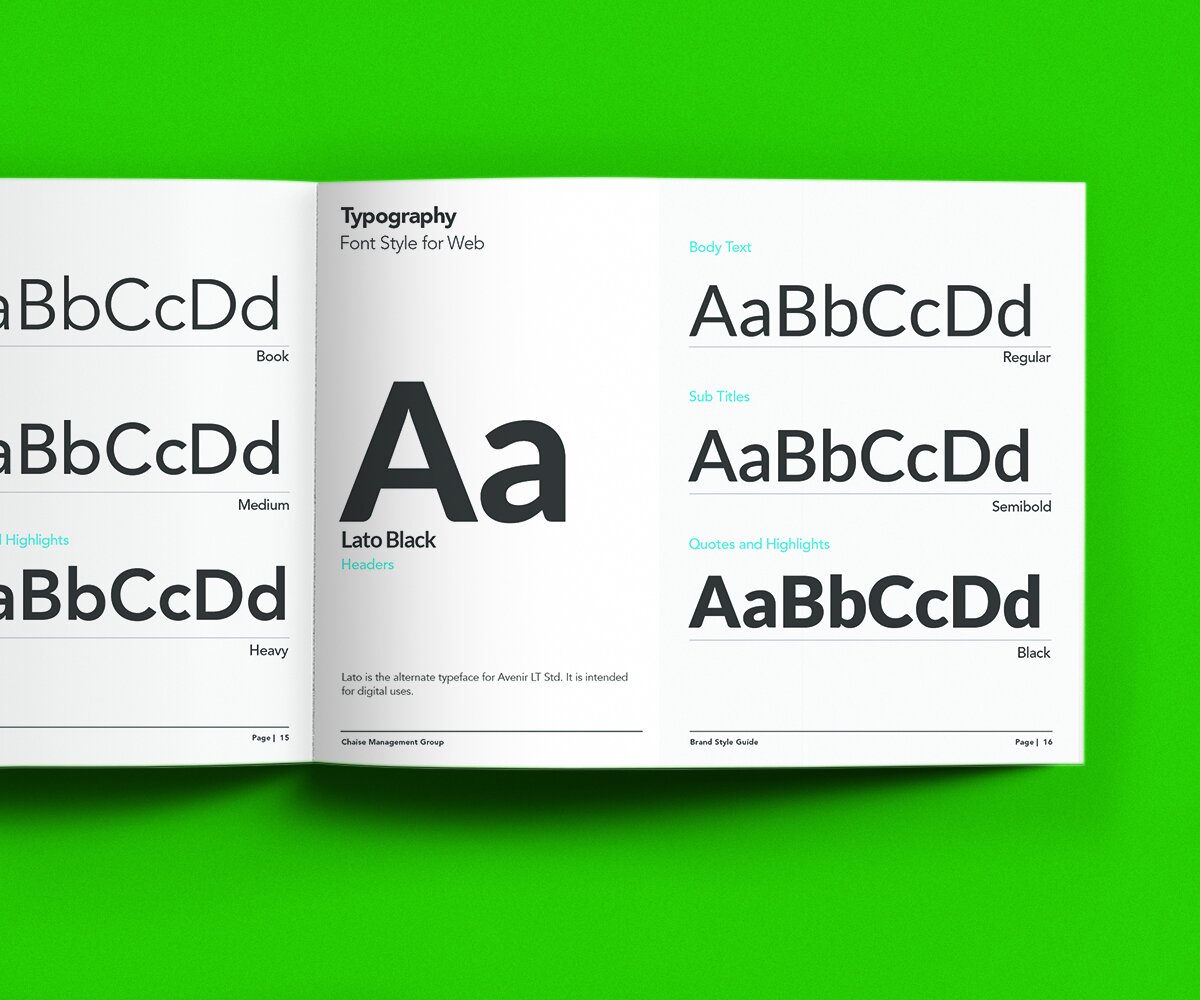
With the brand voice and style in place and fully realized, we prepared a style guide that meticulously detailed the brand’s new strategy and messaging, visual identity, and provided an extensive explanation of logo and photography use as well. This document would serve as Chaise’s design bible moving forward, allowing them flexibility when designing future collateral while ensuring consistency and building further brand equity.
-
The client rolled-out the design with great success, and hired us again for multiple projects including: templates, additional business assets, and promotional materials.
Check out their redesigned website here.
IDENTITY / COLLATERAL
Agency: Michael Marshall Design
Client: Chaise Management Group, LLC